Rethinking application design and operation.
GÉOVÉLO
[UX / UI Design - 2024]
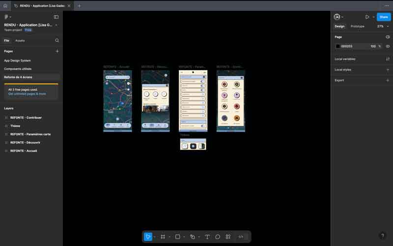
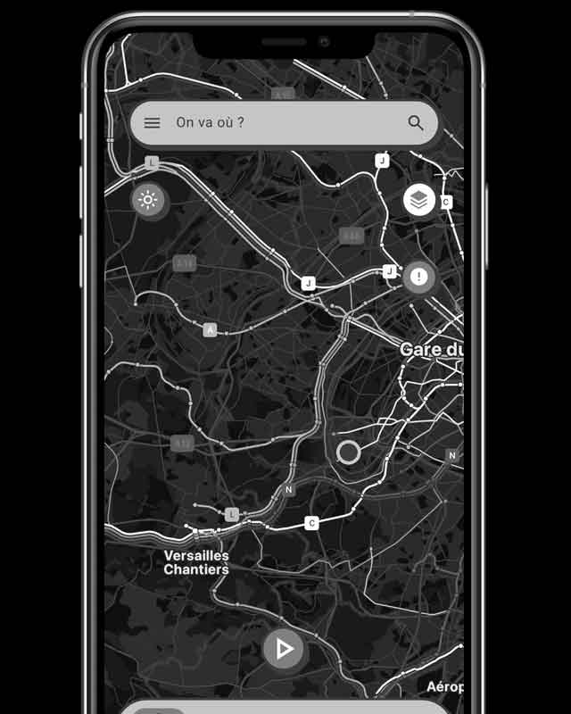
This project reimagines a redesign of the Géovélo app, along with the addition of a new feature. Géovélo is an application dedicated to cyclists and could be compared to Waze.
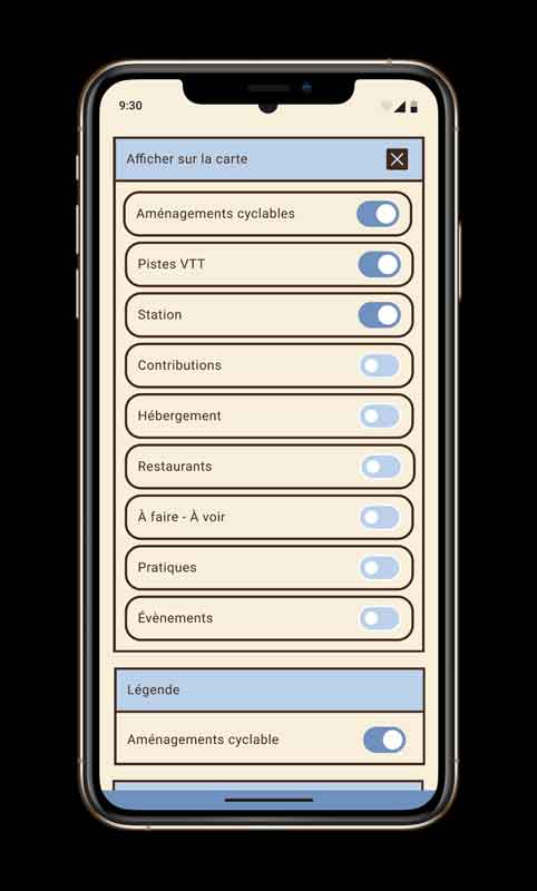
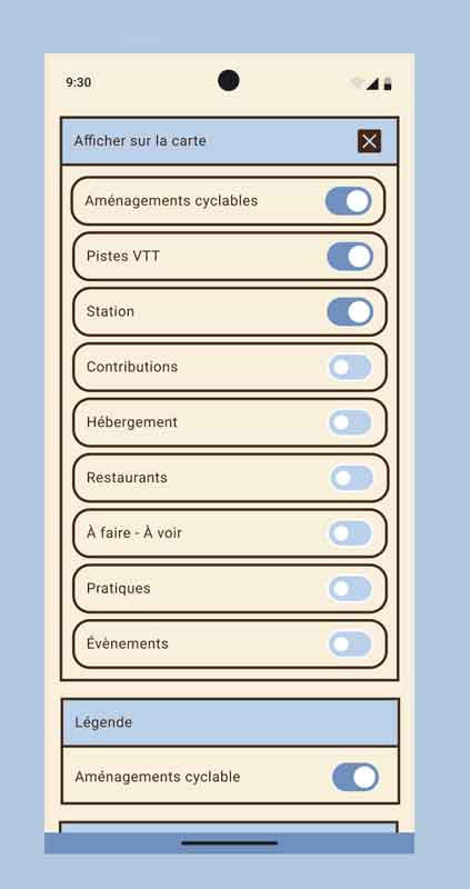
For the new feature, I envisioned adding a dedicated “layer” for mountain bike trails on the map. This would broaden the app’s audience, making it appealing not only to city cyclists but also to a wider range of users. However, this option already exists, but I feel it isn’t prominently highlighted. In my view, it would be more intuitive to integrate it directly into the “Show on map” settings to make it more accessible and to bring this option forward.
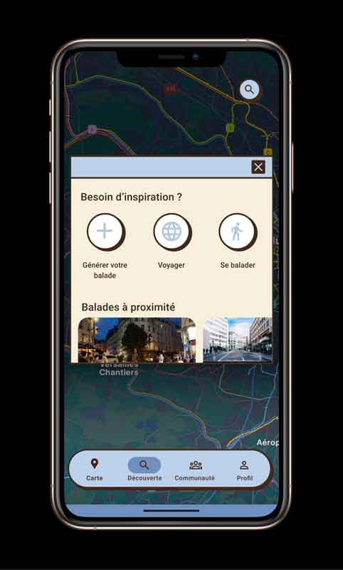
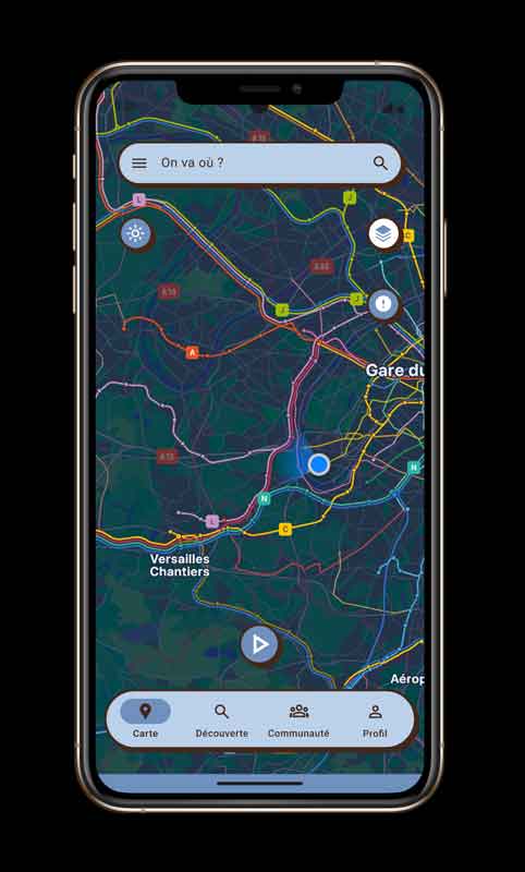
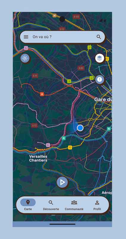
For the redesign of the app, my objective was to create a more playful and friendly interface while improving usability. I aimed to make buttons more readable by separating them from the background, grouping them in a more compact area, and adding a button to close tabs. This would reduce action time for the user, who typically seeks quick and efficient navigation when traveling by bike or on foot.
Additionally, this redesign enhances the playful aspect of the app, especially by emphasizing the badge system. The more kilometers the user covers on foot or by bike, the more they progress and earn badges. This fun design highlights the feature, adding a playful dimension to the Géovélo experience.
In summary, with this redesign, my goal is to improve Géovélo’s user experience while emphasizing its playful and engaging elements.